From a pattern to an explanation
The new process looks worse
The fictional learning center introduces a new registration process. Under the old process, eighty of one hundred applicants completed registration. Under the new one, fifty-nine of one hundred completed it. A report announces that the change reduced success by twenty-one percentage points. The subtraction is correct. The causal conclusion requires more information.
Suppose the old group included eighty applicants whose documents were ready and twenty who still needed documents. The new group included twenty with documents ready and eighty needing documents. Among ready applicants, success rose from seventy-two of eighty to nineteen of twenty. Among those needing documents, it rose from eight of twenty to forty of eighty. Success improved within both categories while the overall rate fell.
These are invented numbers designed to expose a problem. We have not discovered that the new process helps actual applicants. We have discovered that its overall success rate combines performance within groups with the proportions of different groups using it. If the mix changes, the headline can move in the opposite direction from both group-specific rates.
Reconstruct the comparison
Calculate each rate before interpreting the table. Under the old process, ready applicants succeeded at 90 percent and those needing documents at 40 percent. Under the new process, the corresponding rates were 95 percent and 50 percent. The old overall result was dominated by the easier category because it contained four-fifths of the applicants. The new result was dominated by the harder category.
| Document position before registration | Old process: completed / applicants | New process: completed / applicants |
|---|---|---|
| Documents ready | 72 / 80 = 90% | 19 / 20 = 95% |
| Documents still needed | 8 / 20 = 40% | 40 / 80 = 50% |
| All applicants | 80 / 100 = 80% | 59 / 100 = 59% |
For an original arithmetic comparison, imagine giving each category equal weight under both processes. The old average of the two rates would be 65 percent; the new average would be 72.5 percent. This standardized comparison holds the category mix constant. It describes what the supplied rates imply for that common mix. It does not establish that document position is the only relevant difference between the periods.
Timing matters. We defined document position before the registration process began. If the new process itself helps applicants obtain documents, classifying them only afterward would answer a different question and could obscure part of the process's effect. The meaning of a category includes when and how it was measured, not merely the label at the top of a column.
What would have happened otherwise?
A causal question asks about a difference an intervention makes. For one applicant, we would like to compare the outcome under the new process with the outcome that same applicant would have had under the old process in the relevant circumstances. We cannot observe both outcomes for that same registration attempt. Evidence from other attempts must therefore supply a credible comparison.
The potential-outcomes framework makes this counterfactual comparison explicit and distinguishes it from simply predicting an observed outcome. Scott Cunningham's treatment develops the connection to randomization. We use the distinction here to ask what an old-versus-new comparison must stand in for, rather than to assume that a before-and-after difference is itself an effect. Cunningham, Potential Outcomes and Randomization
The previous month is not automatically the missing counterfactual. Demand may change, another employee may start, or a deadline may approach. Comparing two branches at the same time avoids some timing differences but introduces possible differences between branches. A credible design explains why its comparison is informative and which competing changes it can address.
An effect also needs a defined intervention. New registration might mean clearer instructions, more staff, a longer deadline, or all three. If all change together, a study could potentially estimate the effect of the package while remaining unable to separate the contributions. Giving a package a single name should not create the impression that every component has been tested independently.
A diagram makes assumptions visible
Imagine a study finding that appointment holders complete registration more often. One proposed explanation is that appointment status leads to a longer assistance session, which improves completion. Another is that people with documents already ready are more likely both to obtain appointments and to finish registration. These accounts imply different relationships among the variables.
Causal diagrams represent such proposed relationships with directed arrows. An arrow records a causal assumption, and an omitted arrow also carries an assumption. A diagram helps expose a possible common cause or an intermediate step; drawing it does not establish that the relationships exist. Cunningham, Directed Acyclic Graphs
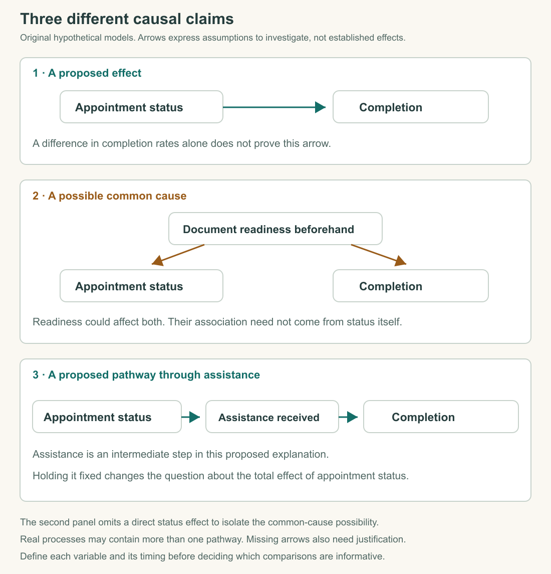
In the common-cause account, document readiness points toward appointment status and toward completion. Readiness can then confound a simple comparison between appointment holders and other applicants: some of the observed difference could reflect their different starting positions. Comparing people with similar readiness may help, provided readiness is measured well and other relevant differences are addressed.
In the assistance account, appointment status points toward assistance, which points toward completion. Assistance is an intermediate step, often called a mediator. Holding assistance fixed would remove the variation through which this proposed effect operates. It would therefore change the question from the total effect of appointment status to a question about pathways not running through that assistance. More statistical controls are not automatically better controls.
The diagram must match the setting. If employees give more assistance to people whose forms are already difficult, difficulty may affect both assistance and completion. We should add that possibility before declaring that assistance fails whenever helped applicants do worse. An explanation can become more complex because the process requires it, but adding an arrow merely to rescue a preferred conclusion still needs justification.
Selection can happen before a row exists
Our records contain applicants who began registration. They do not contain every resident who wanted to learn. Someone who cannot attend during opening hours may never arrive; someone who cannot find the booking page may stop before leaving a record. A study of completed forms therefore observes people who have passed several earlier stages.
This creates a scope problem even before calculating a percentage. If the question concerns success among recorded attempts, the records may be useful. If it concerns access among everyone who wanted a place, we need evidence about people outside that system. Increasing the number of recorded attempts does not fill that gap if the same entry barrier continues to exclude the same kinds of people.
Selection can also affect a survey after people enter the system. In an original example, fifty applicants receive a questionnaire, thirty answer, and twenty-four of those report clear instructions. The response-based result is 80 percent. We do not know whether the twenty nonrespondents would give the same answer.
If none of them would report clear instructions, the proportion among all fifty invited applicants would be 48 percent. If all twenty would, it would be 88 percent. These extreme bounds show what the observed answers alone permit. They are not a confidence interval and do not tell us which value is likely. Additional assumptions or evidence about nonrespondents would be needed to narrow them responsibly.
Measurement is part of the process
A measure is an operational way of recording a concept. Waiting time sounds straightforward until we ask when the clock starts and stops. Does it begin with the first attempt to book, arrival at the building, joining the queue, or the creation of an electronic record? Does it end at first contact, completed registration, or actual enrollment? Different intervals can be useful, but they should have different names.
Suppose the center changes its software so records open at arrival rather than at first staff contact. The recorded interval may become longer even if the experience is unchanged. A graph spanning the software change could then show a jump that reflects measurement rather than service deterioration. Documentation of the recording process is necessary evidence, not a technical footnote that can be omitted from the interpretation.
Reliability and validity ask different questions. A clock that consistently records time from first contact may reliably measure processing time while failing to measure total waiting time. Repeating the same question consistently can likewise produce comparable answers about satisfaction without measuring understanding. Precision about one construct does not validate a claim about another.
The average can hide the experience
Consider five fictional waiting times: five, five, five, five, and thirty minutes. Their sum is fifty minutes, so the mean is ten. The median, the middle value after ordering, is five. If another session has five waits of ten minutes each, it has the same mean but a different median and a very different distribution of experience.
Neither summary is automatically the right one. The mean helps account for total waiting across these visits. The median describes the middle of the ordered distribution. The longest wait reveals a burden that the median obscures. A useful report chooses summaries that address the question and gives enough information to prevent one summary from impersonating the whole distribution.
A group average also does not describe every member. If one registration route has a longer average wait, it does not follow that every person using it waits longer than every person using the other route. The distributions may overlap substantially. A claim about a group pattern should remain a group claim until individual-level evidence supports something more specific.
Uncertainty has more than one source
Small samples can produce unstable estimates because the particular people or occasions included matter. Under a suitable probability-sampling design, statistical methods can describe sampling uncertainty. A confidence interval is tied to a procedure and its assumptions; its nominal coverage concerns repeated use of that procedure. It is not a certificate that every possible source of error has been included. NIST, Confidence Limits for the Mean
For the center, a narrow statistical interval could coexist with a badly defined timestamp or a sample that excludes everyone who failed to reach the desk. More observations might make the estimate of the wrong interval extremely precise. We should distinguish uncertainty about sampling from uncertainty about measurement, selection, and the causal assumptions behind a comparison.
Random assignment also allows chance differences between groups in a particular experiment. Its value is that assignment does not systematically follow participants' preferences or starting positions by design, not that every realized group is guaranteed identical. The analysis still needs to respect how assignment occurred and how outcomes were observed, including whether participants left the study differently across groups.
A result can be statistically distinguishable from no difference yet too small to matter for the decision, or too imprecise to exclude an effect that would matter. Those judgments require an effect size, a scale, and a substantive standard. Reducing a complex result to significant or insignificant discards information a decision maker may need.
Write the claim the evidence supports
For the opening example, an accurate report would say that recorded completion fell from 80 percent to 59 percent while the share of applicants needing documents increased substantially. Within each supplied document category, completion rose. The figures show that the overall decline cannot be interpreted as a deterioration in both category-specific rates. They do not, by themselves, establish the causal effect of the new process.
A next step could compare the same kinds of applicants across periods while checking staffing, deadlines, and how document position was recorded. If the intended question concerns people deterred before applying, that design still needs a broader source. Every improvement to a comparison should be connected to a particular weakness rather than presented as a general cure for bias.
The purpose of these distinctions is to make warranted conclusions possible. We can describe a pattern accurately, identify a plausible mechanism, and state what would strengthen a causal account without pretending to know everything. A careful finding is often more useful than a dramatic one because another reader can see where it applies and what could change it.
Application
Allow about twenty-five minutes.
- Recalculate the opening table's four category-specific rates and two overall rates. Explain the reversal in plain language without calling either calculation false.
- Draw the common-cause and assistance-pathway accounts using words and arrows. Explain why document readiness measured before registration differs from assistance delivered during registration.
- In the survey example, calculate the observed response rate and the proportion reporting clarity among respondents. Explain why those are different percentages. Name the assumptions needed to treat the latter as representative of all invited applicants.
- Write a three-sentence finding using the opening table: one sentence of description, one of interpretation, and one limitation.
The survey response rate is thirty of fifty, or 60 percent. Reported clarity among respondents is twenty-four of thirty, or 80 percent. Generalizing that second result needs justification about nonrespondents, not simply a larger font on the percentage. The table's within-category improvements coexist with an overall decline because the categories receive different weights in the two periods. A strong finding explains this and leaves the causal effect unresolved until the comparison can address relevant differences.