Legibility, proportion, and fit
A watch looks perfectly clear in a photograph that fills half a laptop screen. On the wrist, the minute hand is a small bright shape beneath a reflection, the date needs a second glance, and the case catches a shirt cuff. None of those experiences is inconsistent with the photograph. The photograph answered a different question. It showed a carefully arranged object at an enlarged scale, under chosen lighting, from one direction.
Design judgment begins by bringing the task back into the picture. Are you checking whether it is nearly lunchtime, reading an exact minute, timing a short interval, or finding the date? Are you sitting at a desk or glancing briefly while carrying a bag? A design can serve one task well and another poorly. This chapter develops a way to explain those differences without confusing personal preference with a universal law of good proportions.
Legibility is a relationship
Legibility is the ease with which a particular reader can distinguish and interpret information under particular conditions. It is not a substance poured into a watch by adding white paint or large numerals. Contrast helps distinguish a figure from its background, but the figure must also be identifiable, sufficiently large for the reader, and connected to the right scale. The shorter hand and longer hand may each be visible while still being difficult to tell apart quickly.
Start with contrast. A dark hand against a pale dial can have a clear boundary. A polished hand, however, reflects its surroundings; its apparent brightness can change as the watch or light moves. A hand that looks bright against a dark dial in one photograph may become harder to distinguish in another setting. This is a reason to examine several ordinary viewing angles, not a reason to declare every polished hand illegible. Shape, faceting, background texture, and the crystal's reflections can all change the result.
Now consider identification. If both hands have identical outlines and differ only slightly in length, the reader must work harder to decide which carries minutes. If the minute hand approaches the minute track while the hour hand ends near the hour markers, their relationship to their scales provides a second cue. A distinctive tip can provide another. Redundant cues are useful because a single cue may weaken under a reflection or an obstructed view.
Numerals do not solve every reading problem. Large hour numerals may improve hour recognition while leaving the minute divisions small or absent. A date can be sharply printed yet difficult to read because the aperture is small. Luminous paint may aid a dark-room task but requires appropriate conditions to work as intended; this course does not infer brightness or duration from the paint's pale appearance in a catalogue image. The SRPE55 specification identifies luminous material on hands and markers. That statement is different from a comparative night-reading test.
Hierarchy decides what arrives first
Visual hierarchy is the order in which information tends to demand attention. On a time-only analog watch, the hierarchy may favor hands and hour markers. Add a bright date window, a colored seconds hand, several subdials, and a large logo, and the elements begin to compete. Competition is not automatically bad. A timed event may make an elapsed-seconds hand more important than the ordinary hour hand. The point is to ask whether the attention structure matches the intended task.
Consider an invented dial with a large red central seconds hand, thin gray hour and minute hands, and a pale background. A designer might intend an energetic appearance. For a reader trying to identify the hour quickly, the most conspicuous element may be the least relevant one. We can describe that tension precisely without declaring the design a failure. The next question is whether its other cues compensate under the reader's actual conditions.
The public FHH account of dial making describes the simultaneous demands of visual appeal and readability in a very small area. Treat those demands as a design problem, not as enemies. A distinctive arrangement can help recognition. Empty space can separate information. Decoration can provide orientation or obscure it, depending on how it is placed. Saying that a dial is “busy” identifies an impression; explaining which scales interfere with one another begins an analysis.
Digital displays have hierarchy too. In the Casio image introduced in Chapter 1, the main time digits receive more space than the secondary information. That arrangement makes a claim about likely use: some information deserves a fast glance, while other information can tolerate closer attention. A digital interface may also reuse the same area for different modes. The cost of that economy is that the reader must identify the current mode before interpreting the number.
Test one change at a time
Imagine two original teaching dials with the same circle, same time, and same minute marks. One has distinct dark hands; the other has similar pale hands. That is a useful comparison because the task and most of the geometry remain fixed. If you instead compare a large bright chronograph photograph with a tiny dark photograph of a different watch, you cannot assign your reading difficulty to hand design alone. Image size, exposure, background, and information load have all changed.
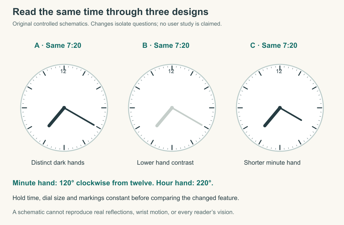
Read the figure before looking at its answer. At twenty minutes past seven, the minute hand points toward the four-hour position and the hour hand has advanced beyond seven. A hand pinned exactly to seven would describe an inaccurate teaching diagram. The two hands therefore encode different angular scales, and the hour hand carries the fraction of the hour as well as the hour number. This is one small place where attractive illustration must submit to correct information.
Compare the variants while holding the reading task constant. Which tip can you connect most easily to a minute mark? Which pair makes hand identity most obvious? You are reporting an experience of these schematics on your screen. You are not conducting a representative study of watch users, and the figure cannot reproduce glare, visual impairment, movement, or the optical behavior of a real crystal. Its purpose is to isolate questions that a later physical comparison could investigate.
A useful observation record names the conditions: approximate viewing distance, image size, lighting, whether corrective lenses were used if relevant to the observer, and the task. It also distinguishes a mistaken reading from a slow correct one. “I took longer to locate the minute hand” is more informative than “the watch is bad.” If working only from images, preserve that limitation in the conclusion. There is no need to pretend that a small exercise produces laboratory evidence.
Diameter is one dimension
A round watch is often introduced by its diameter, but a wrist does not experience diameter alone. Case length, lug extension, thickness, the shape of the underside, and the first movable point of the attachment all matter. Two cases with the same diameter can occupy different lengths along the arm. A smaller diameter with long, straight lugs may extend farther than a larger diameter with short, downward-curving lugs.
The original matched-scale comparison below uses invented dimensions to make that relationship visible. Watch A has a 38 mm case diameter and a 50 mm lug-to-lug span. Watch B has a 40 mm diameter and a 44 mm span. At the same drawing scale, A is narrower across the case but longer along the arm. The word “smaller” is therefore incomplete unless you specify the dimension. Neither outline reproduces a marketed watch.
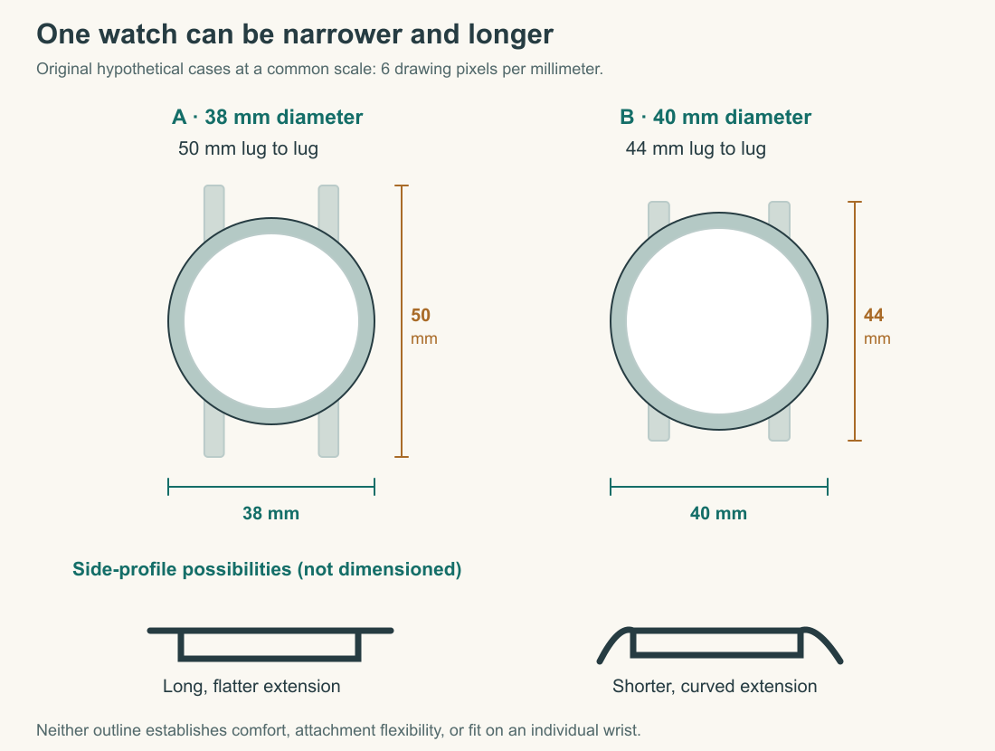
Lug width is another measurement entirely. It is the spacing associated with the attachment between the lugs, not the length from the upper lug tips to the lower tips. Confusing those terms can turn a useful specification into nonsense. Integrated attachments can make conventional measurements less straightforward; the important functional question is where the bracelet or strap can bend around the wrist. A rigid first link can extend the effective span beyond the case's nominal lug-to-lug length.
Rectangular cases need both length and width. Comparing a rectangle's long dimension directly with a round case's diameter conceals the different area and outline. Even equal front areas would not make them equivalent on the wrist: corners, curvature, attachment position, and thickness remain different. Dimensions are constraints for interpretation, not a shortcut to a single ranking. Manufacturer conventions may also differ, so check whether crowns or projections are included before calculating a comparison.
Fit is a three-dimensional encounter
Circumference describes how far a tape travels around a wrist. It does not uniquely describe the wrist's cross-section. Two people with the same circumference may have different widths across the top and different curvature at the sides. A rigid case and its first links meet those shapes differently. This is why a universal table assigning one ideal case diameter to every wrist circumference is too confident for the evidence it contains.
Thickness affects more than appearance. A tall case may meet a cuff differently and place mass farther from the wrist. The underside may be flat, curved, or dominated by a projecting case back. The crown's location can affect contact when the wrist bends. These are possibilities to examine in ordinary use, not predictions that follow from a front image. No learner needs to buy a watch to recognize that the missing side view contains relevant information.
Attachment adjustment matters because a well-proportioned case can still be uncomfortable on a poorly adjusted strap or bracelet. A strap hole creates discrete length choices; a clasp may provide other adjustment arrangements. The relevant question is whether the available fit range suits the wearer and conditions. This chapter does not prescribe a tightness rule for everyone or teach bracelet modification. If you already own a watch, simply note whether it moves, presses, catches, or interferes during ordinary safe activity.
Do not turn a fit exercise into an endurance test. Pain or skin irritation is information to stop and address, not a necessary stage of learning to appreciate a design. For readers working from photographs, draw the missing evidence you would request: side profile, underside, bracelet articulation, and stated dimensions. An honest request for a better view is a valid analytical result. It is preferable to inventing a wearing experience from a persuasive product photograph.
Explain a tradeoff without declaring a winner
Suppose a hypothetical designer enlarges a date window. The date may become easier to locate, but the opening can displace a marker and change the balance of the face. Suppose the designer makes the case thinner. That may help with a cuff, but the complete engineering consequences depend on the actual construction. We cannot infer reduced reliability or superior refinement merely from height. A tradeoff is an interaction between objectives, not a stock story that every change must have a particular penalty.
A useful evaluation follows a short chain. State the task, identify the feature, explain the proposed consequence, and name the evidence that would test it. “For quick minute reading, the long contrasting hand appears easier to connect to the outer marks in this image; I would compare it at ordinary wrist scale under changing light” is defensible. “This is objectively the best dial” hides both the task and the missing test.
Personal attraction belongs in the account too. You may prefer a sparse face, a crowded instrument-like layout, a small rectangle, or a wide round case. Those preferences become clearer when separated from functional claims. A reader can appreciate an object despite a reading compromise, or reject an otherwise practical object because its appearance gives no pleasure. The course is not trying to replace taste with a spreadsheet. It is teaching taste to coexist with accurate description.
By the end of a comparison, you should be able to explain why two different designs could each make sense. One may favor immediate recognition of the hour; another may offer more information through a denser interface. One may extend farther along the wrist while remaining narrow across it. These are concrete differences that survive the removal of price tags and logos. In the next chapter, we will give the same careful treatment to the materials and surfaces that make those forms visible.
Application
Use the three dial schematics at the same displayed size. Record which you find easiest to read at 7:20 and explain the contribution of contrast, hand identity, and hand reach. Identify two conditions the schematics cannot test. Then compare the two case outlines: name the narrower case and the shorter lug span, and explain why they belong to different examples.
Write a four-sentence design judgment for an imaginary reader who checks the time briefly and wears close-fitting cuffs. Include one plausible advantage, one unresolved fit question, and one preference that you cannot turn into a universal requirement.
Model interpretation: A is narrower across its case; B is shorter from lug tip to lug tip. The supplied dimensions do not establish comfort. A long, distinct minute hand can support connection to its scale in the schematic, but glare and actual wrist viewing require other evidence. A preference for a quieter dial is legitimate when identified as preference; it does not prove that an information-rich design is poorly made.